Record Breaking UK Summer
Introduction
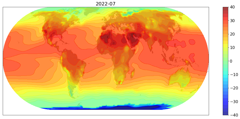
Inspired by this twitter, I downloaded monthly temperature data and produced similar plots…to celebrate hottest UK summer. Unlike their anomaly maps, I simply produce actual temperature maps. Here is one for July 2022.
Notes:
- Jupyter notebook is here
- Data source: land temperature, sea temperature
Procedure
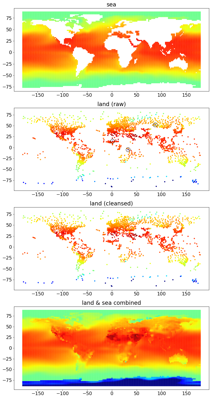
The procedure to produce a combined temperature map can be summarised into the following four figures:
Steps
The steps in the procedure are as below:
- Download monthly data (see below for the data source). One for land and the other for sea temperatures.
- Sea data are already given in a rectangular form over longitudes and latitudes. Moreover, they seem to be clean - great! The values are missing over the land coordinates. See the first sub-figure above.
- Land data are recorded at stations over lands - so non-rectangular form. And, some records seem to be obviously outliers…. arg… See the second sub-figure above where some outliers are enclosed by circles.
- Cleanse land data - identify and remove outliers. The third sub-figure is the cleansed land data. Also, see below on the outlier identification method.
- From the cleansed land data, infer the missing temperatures in the sea data set, producing a combined temperature dataset over the rectangular grid. See the fourth sub-figure above. For the inference (imputation) method, see below.
- Transform the combined data through a map projection, and draw a contour plot. See below further details.
Outlier Detection
A temperature record is deemed to be an outlier if it is very different from neighbouring values. To make this statement quantitative, we need to
- Define the distance between two points. This is easy. Use the great-circle distance.
- Specify an error band at each point. If the record is outside the band, it is tagged as an outlier.
Local and Global Methods:
Two methods are considered
-
a local method: For each record point, take $K$ nearest neighbouring points (measured in the great-circle distance), and calculate the lower, middle and upper quantiles, denoted by $l$, $m$, and $u$, respectively. Applying a scaling factor $s$, an error band for the point under question is set as
\[\begin{equation} [m+s(l-m), m+s(u-m)] \label{E:local-band} \end{equation}\] -
a global method: Let $c(\lambda, \phi)$ be the temperature at longitude $\lambda$ and latitude $\phi$. Since the temperature variation is more pronounced along the latitude, we make a global spline fit $f(\phi)$ and calculate the lower, middle and upper quantiles of residuals $c(\lambda,\phi) - f(\phi)$, denoted by $L$, $M$, and $U$, respectively. Apply a scaling factor $s$ to produce an error band profile
\[\begin{equation} [f(\phi)+M+s(L-M), f(\phi)+M+s(U-M)] \label{E:global-band} \end{equation}\]
For illustrations, see the figures on the top row below.
- For both methods,
- low, middle, and upper quantiles are calculated at 5%, 50%, 95%.
- $s = 4$
- For the local method, $K=5$.
- For the global method, we used the cubic spline with 9 knots.
Observe that
- local method:
- The width of the error band is sensitive (maybe too much) to the dispersion of neighbouring temperatures. For example, it does a good job of capturing variations toward the south pole well, identifying no points there.
- The method does not work well when a neighbouring stations are densely located, creating very small error band. For example, two points (those closest to blue data points) are incorrectly identified as outliers.
- global method: The opposite observations can be made.
- Some points near the north and south poles are incorrectly identified as outliers.
- No interior points are incorrectly identified as outliers.
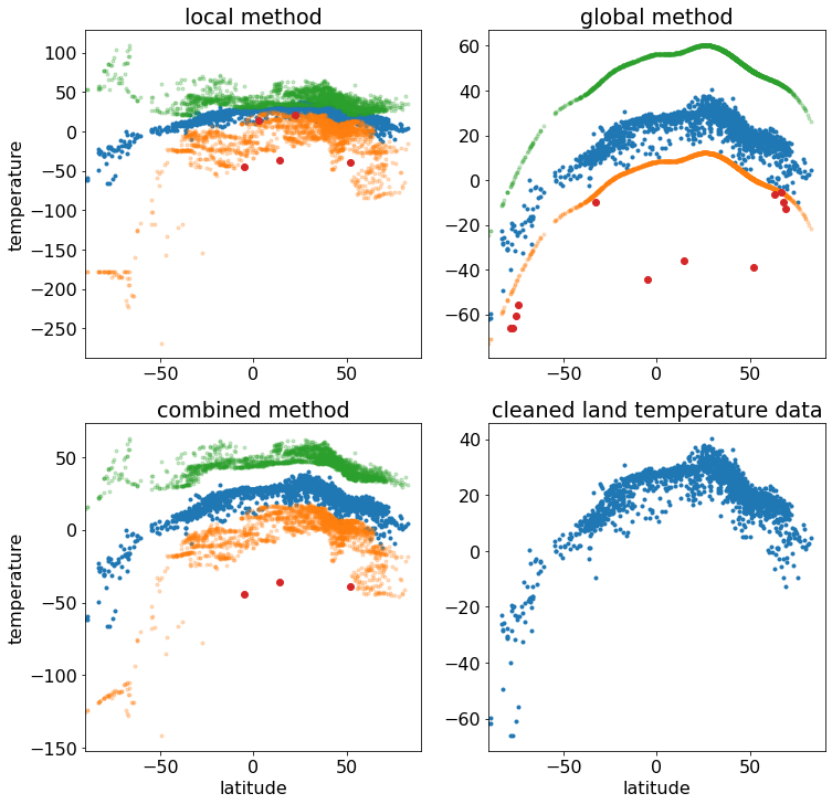
- (latitude, temperature) scatter plots.
- blue points: data
- green points: upper bounds of error bands
- orange points: lower bounds of error bands
- red points: outliers, i.e. those outside the bands
Combined Method
Let’s take the average of the local and global bands to get the combined band, which I hope to be the best of both. See the bottom-left figure, which seems to be working well! The bottom-right figure is the cleaned land dataset.
Land Temperature Inference
From the sea data set, consider a (longitude, latitude) point corresponding to a land location. We impute the temperature at the point as the weighted average of the cleaned land temperatures. The weighting is given as
\[\exp(-d^2/w)\]where $d$ is the great-circle distance and $w$ is the width to determine the width. $w$ is set to the larger of (i) the half of the distance of 1 degree in latitude and (ii) the distance to the closest land station.
Map Projection
I used GeoPandas to package to apply ESRI Projection 54012.
TODOs
- country specific historical time series.
- make them into an animation.